Brand Evolution Case Study — Insight Health
Giving a fast-growing hospital system one brand to match its one promise
How it started
Insight Health System was growing fast. In about 17 years it went from a handful of sites to roughly 40 facilities and 4,200 employees, including hospitals, health care centers, specialty clinics, and freestanding ERs, in markets as different as Chicago, Illinois and Coldwater, Michigan.
That's a good problem to have. But as each new facility joined, it brought its own way of looking and sounding, and over time the Insight brand splintered. Stakeholder interviews summed it up with a phrase borrowed from William James: "blooming, buzzing confusion."
The answer was already hiding in plain sight. Insight had a tagline, Patient Care Second to None, but it was doing the job of a slogan when it could have been a strategy. Working alongside Insight's marketing agency, Rice McVaney Communications (RMC), our combined teams set out to make that line the center of everything. It would be the promise every facility makes, the lens for every piece of content, and the first thing a patient feels no matter their location.
The positioning came down to two ideas patients care about most: quality (care that's second to none) and location (right here, where you live). Our job was to make that promise impossible to miss. That meant finding new ways to say Second to None and building a visual identity strong enough to carry it across 40 facilities and every channel. We had to do it quickly, keeping the existing logo exactly as it was.
What we did
We immersed fast. We reviewed RMC's research, the stakeholder findings, and Insight's existing materials. The goal was to understand what made this system different before deciding what it should look like.
We explored three distinct directions. Each mood board took its own path to evolving the brand. Each one included a treatment for the existing logo, a new way of presenting Second to None, a photo style, an expanded color palette, and typeface options. We also wrote two headline approaches for each, one plainspoken and one more poetic, so the team could see how the voice and the visuals worked together.
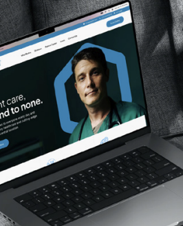
We tested every direction on real work. A brand that only looks good on a mood board isn't a brand yet. So we showed each direction applied to the communications Insight actually needed. That meant redesigned web pages using live content, a social post driving appointments for a pain management physician, an awareness post for the Chicago hospital, a full-page ad introducing a new physician, and a post announcing the groundbreaking of a new emergency room.
We refined with inputs from both teams. The work went through a round with RMC and two rounds with Insight, so the final direction reflected both the strategy and the people who would live with it every day.
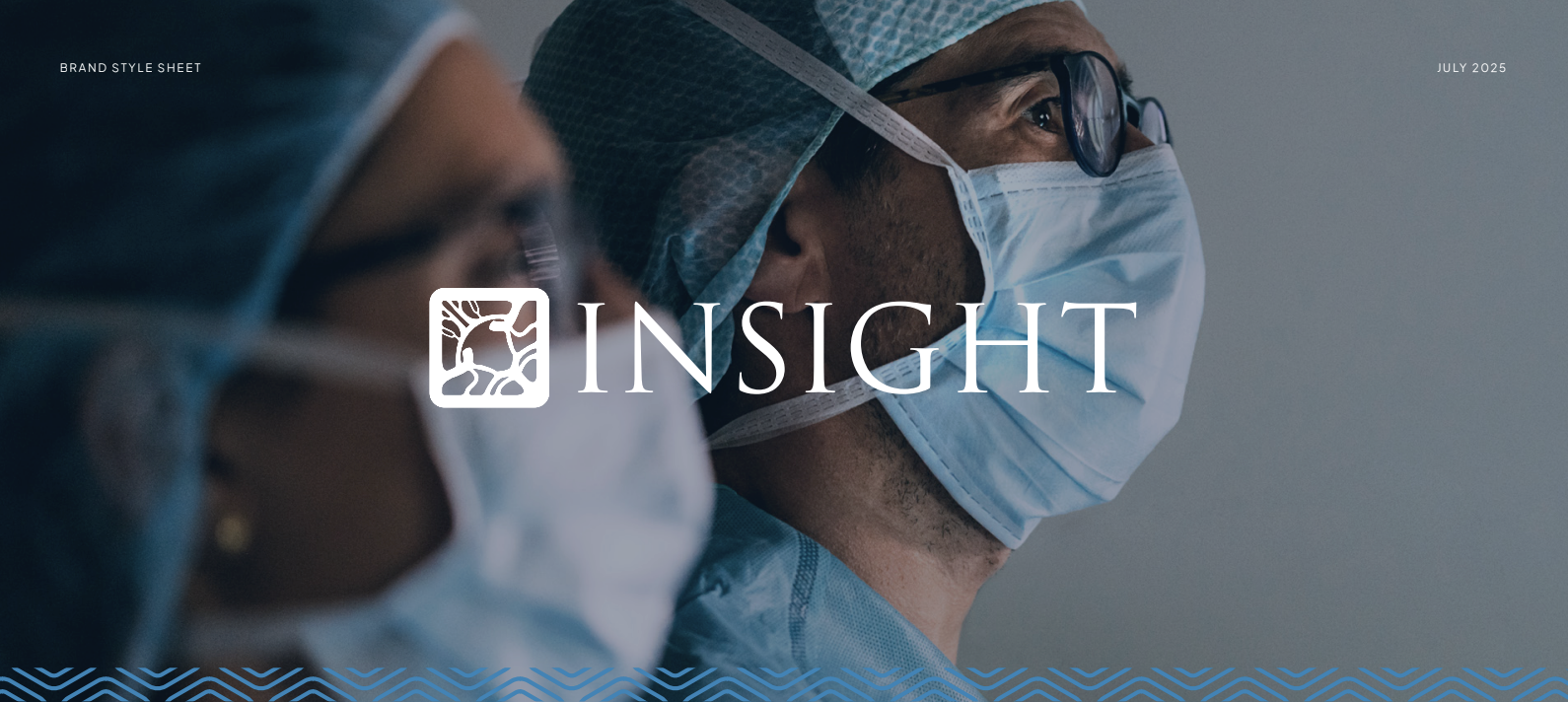
We made it usable. The final deliverable was a brand guide capturing the approved direction, sample executions, and practical guidance on usage. That way every facility, vendor, and future hire could apply it consistently.
How it’s going
Health systems that grow quickly often end up with a brand that reflects how they grew rather than who they are. Patients don't see an org chart. They see a logo on a sign, an ad in their feed, a website they visit at 2 a.m.
Working with seamless collaboration, our combined agencies gave Insight a single promise and a single look to deliver it, so a patient in Coldwater and a patient in Chicago meet the same Insight, and that Insight is second to none.